abstraction & color study
painting, sculpture, color theory
Oil paint on paper (18x24in), cardboard and colored paper, lighting
Role
Studio Art Painting Student in Sarah Navasse-Miller’s Spring 2022 Painting for Non-Majors Class
goal
Explore color, light, and space through a representational painting of an abstract sculpture.
Adapt development through painting critiques.
impact
Created a visually strong painting that leads the viewer’s eye and captures nuances in light and interactions between adjacent colors.
THE JOURNEY
Process
The sculpture
The development of the sculpture made of cardboard and paper was first. I constructed my cardboard corner by gluing the planes together with hot glue; then I decided on my color palette by collecting various papers and evaluating how well the colors worked together. My final palette was inspired by sunset colors and modified by the challenge of including complementary colors and warm/cool variations of the same color. Purple and yellow were my complementary colors, and I used warm and cool variations of purple, yellow, and pink. For my composition, I cut out abstracted flowers, various windows, and simple samples from colored paper to create interesting forms and shadows. I used regular glue to put together the paper sculpture on the cardboard structure (1).
The painting
After creating the sculpture, I sketched potential compositions for the painting by changing the orientation and viewpoint of the sculpture, as well as the position of the light source (2). I decided on the composition that created the most interesting shadows, color interactions, and movement, and started on the painting. My painting process involves first outlining the major shapes of the composition with paint (3), then blocking out major shapes with solid color (4), and lastly, focusing on mark-making with creating texture with my brushstrokes and fine-tuning the shapes, values, and colors (5) to achieve the final painting (6). Throughout the painting process, we engaged in critiques. During the final critique, Sarah played with the orientation of my piece and the class evaluated how well the work looks horizontally (6) versus vertically (7).
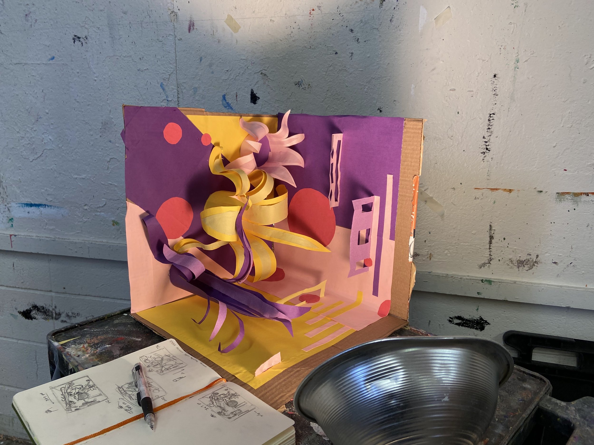
(1) Construction of the abstract sculpture with light source
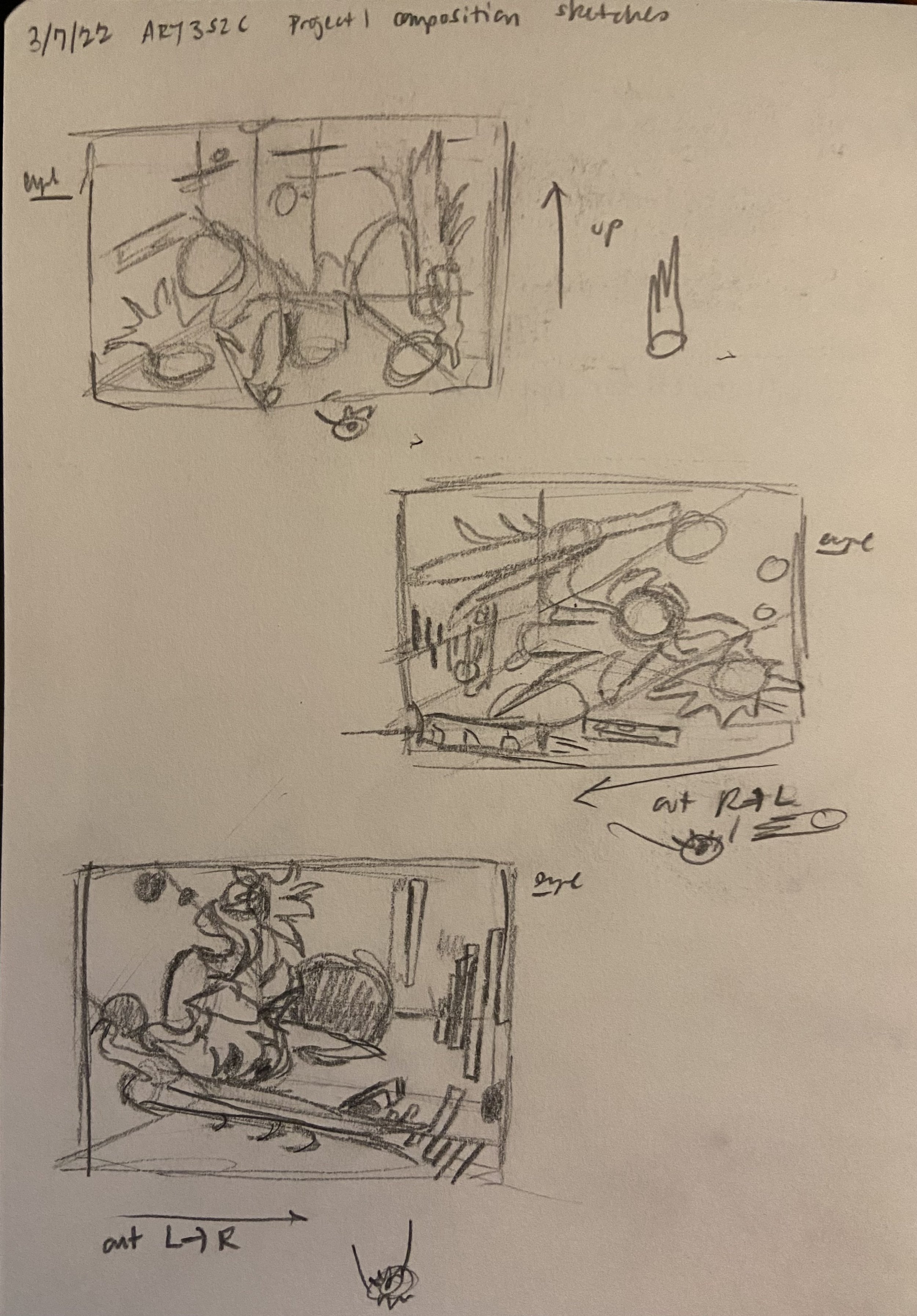
(2) Sketches of various views of the sculpture to ideate interesting compositions
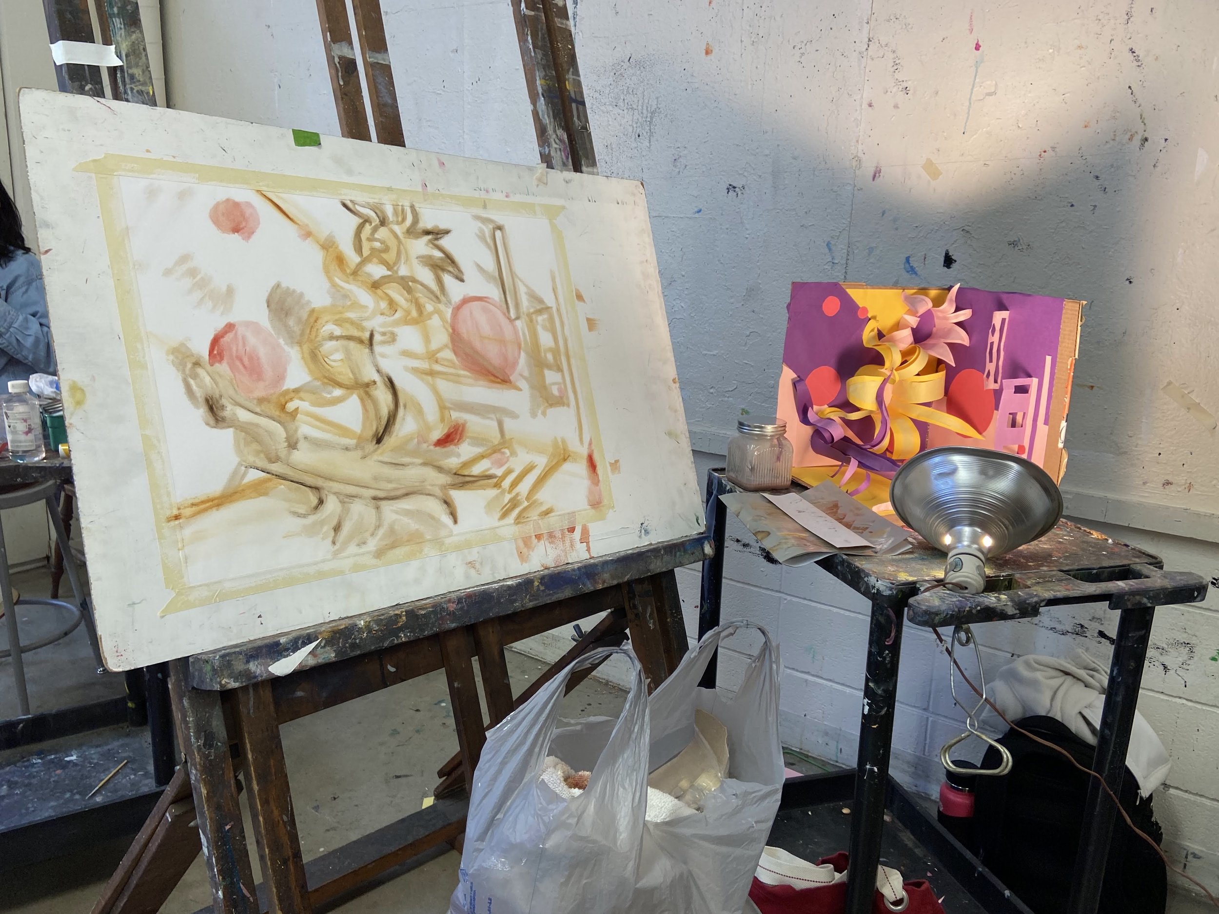
(3) Set up, including first painting layer in which forms were sketched
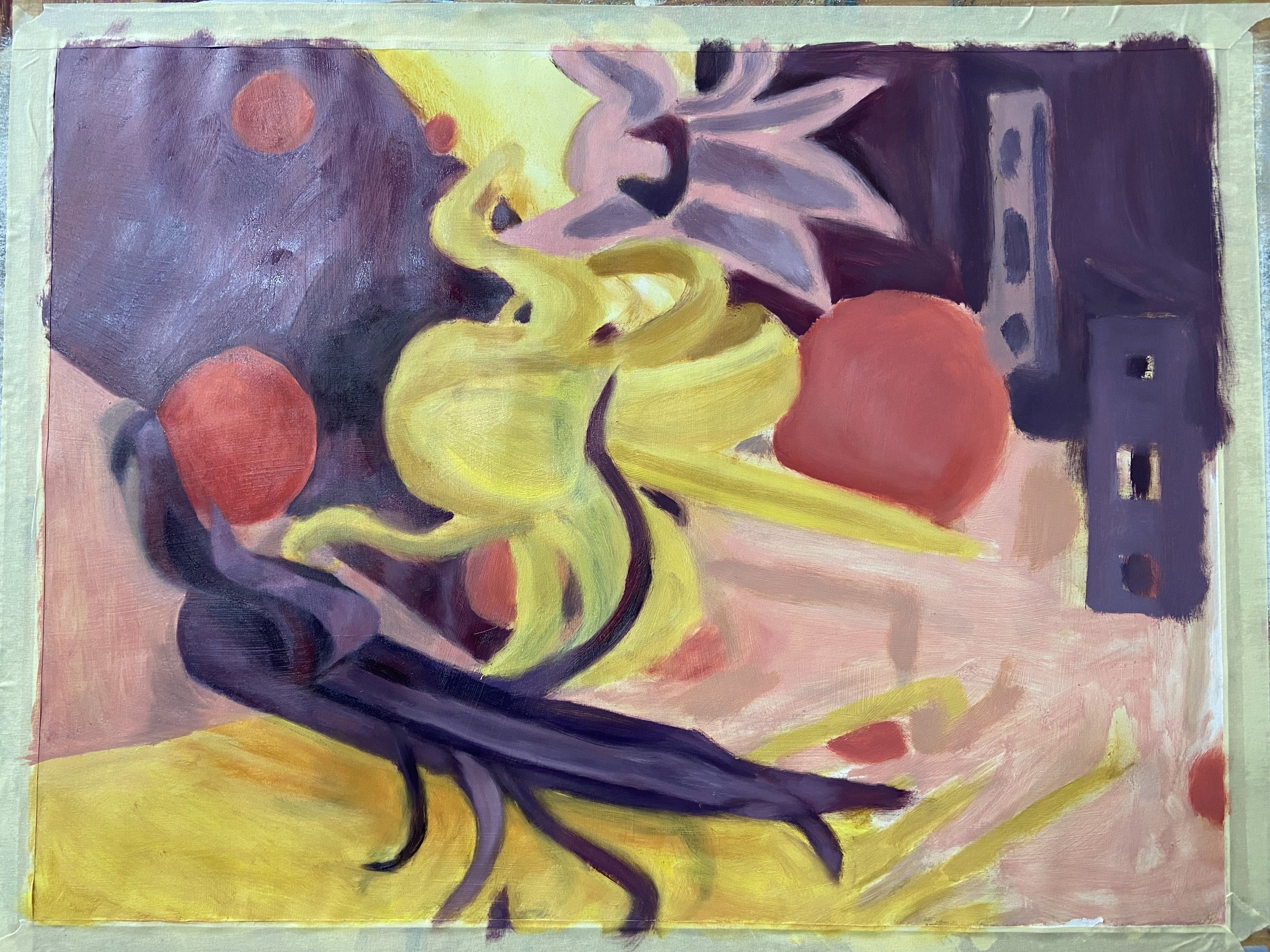
(4) Second layer, blocking out primary shapes, highlights, and shadows
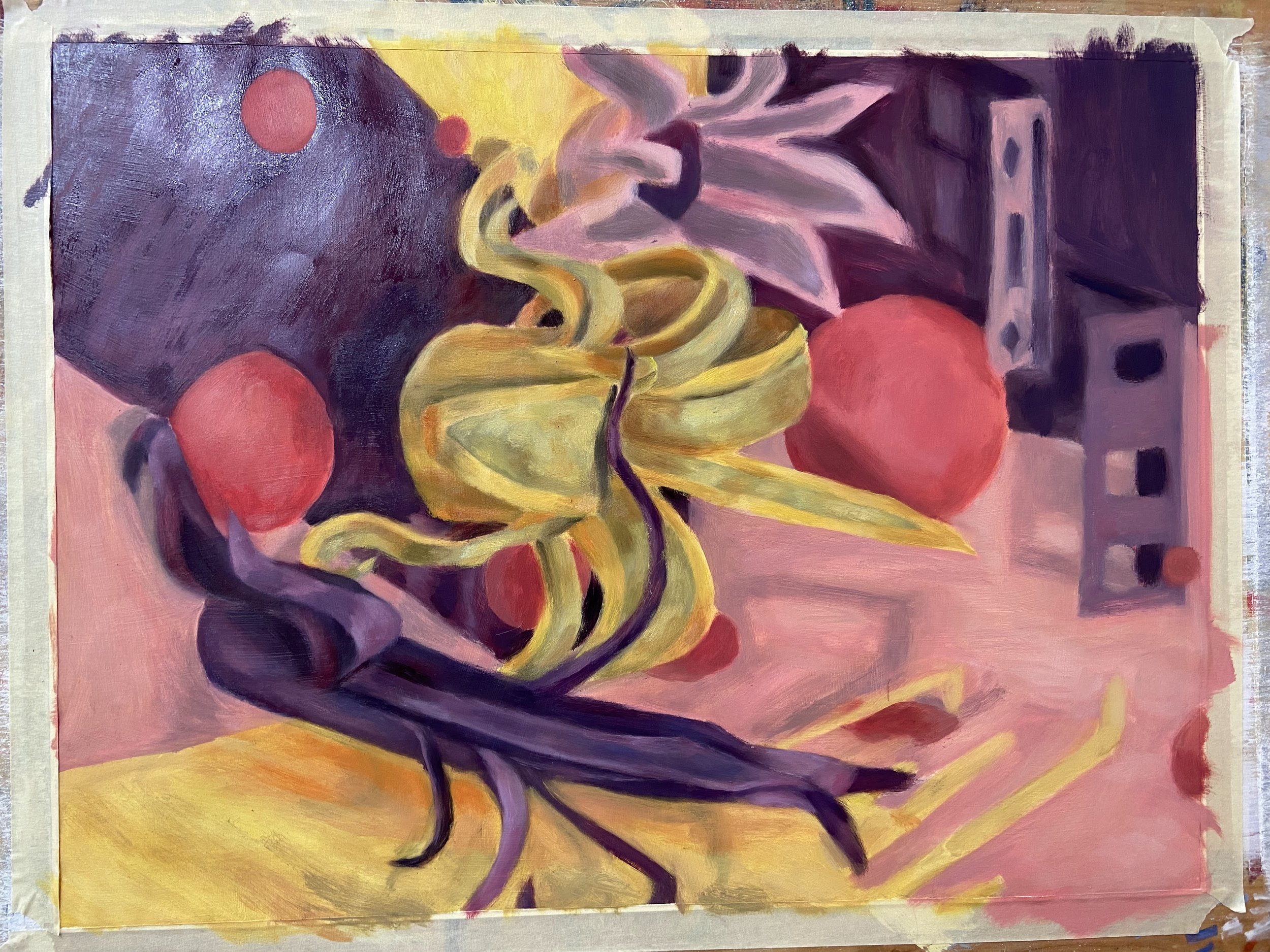
(5) Third layer, fine tuning shapes, highlights, and shadows
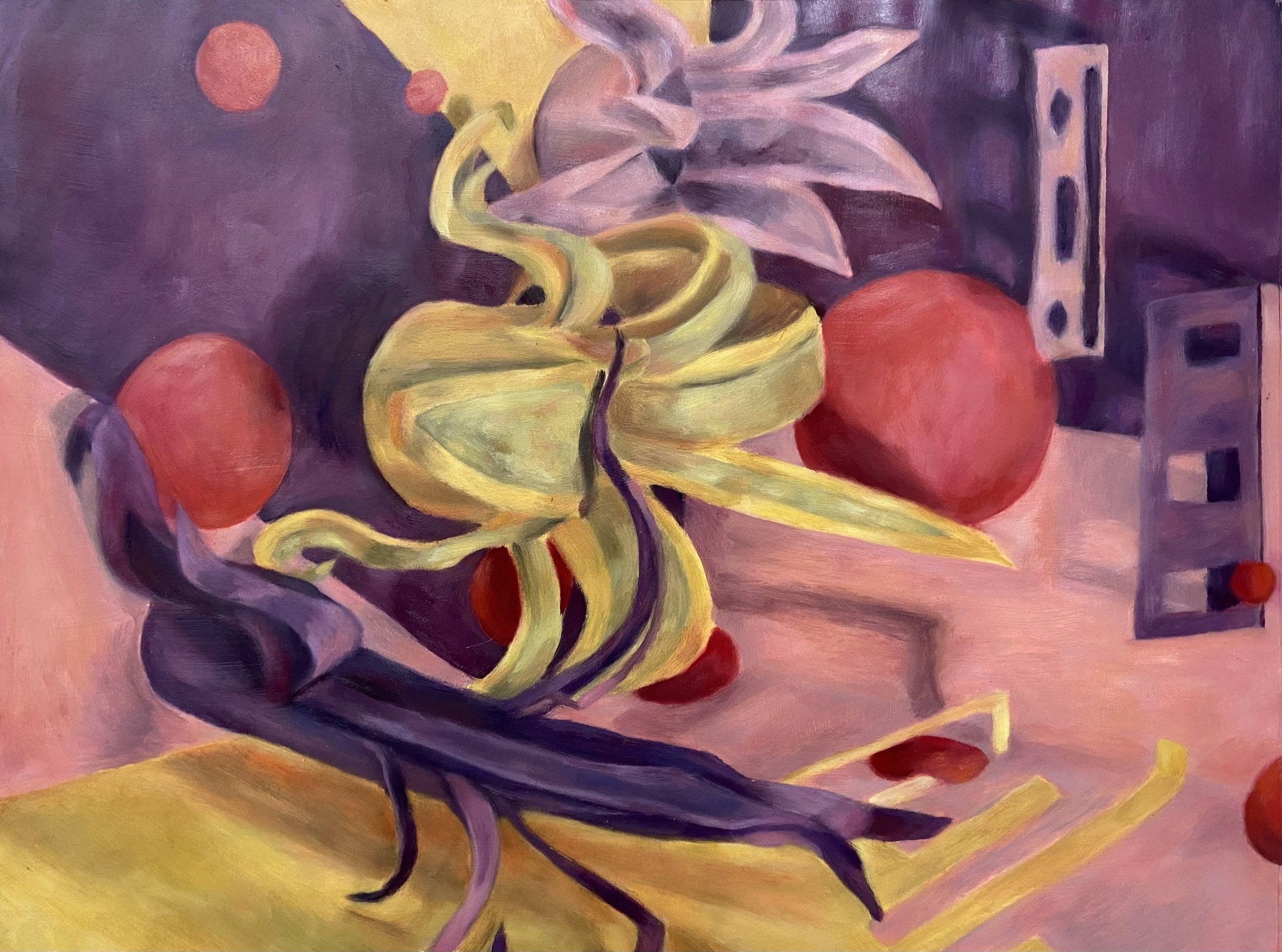
(6) Final painting (horizontal)

(7) Final painting (vertical)
Reflection
This work challenged me to create an interesting composition and hone my attention to color interactions. I enjoyed working with all the moving parts of the sculpture, including playing with scale and perspective, which improved my ability to develop a compelling composition that moves the eye with form and color. The most challenging aspect was achieving accurate levels of warmth and coolness because of the nuanced color interactions that resulted from the warm light source and the influence of adjacent colors. To overcome this challenge, I swatched colors from my mixing palette, brought the color on my paintbrush near the sculpture, and squinted to evaluate accuracy. Overall, I was satisfied with the final painting and the process. The horizontal (6) and vertical (7) orientations of the final work respectively display a different scene. The vertical version communicates more plant-like images, whereas the horizontal version communicates less obvious, more abstracted shapes because of the unconventional direction of lighting and movement of forms from the walls. My eye is most familiar to the horizontal version, but the vertical version reminds me of an alien-like plant garden, which I personally enjoy.